Tuesday, August 13, 2013

Painted Dark Grey Doors


Ever since painting the half-bath door glossy dark gray, I've been wanting to paint the doors in the upstairs hallway the same way.  Painting doors isn't as daunting as you might think, and the impact adds some nice drama to a space.  Here's how the doors looked originally:


And below is how they look after two coats of paint- Sherwin Williams Brown Fox in semi-gloss for extra shine.  


The paint color is a warm dark gray with a hint of brown in it.


I painted these doors off the hinges, but in retrospect, I don't think that's completely necessary as long as you keep the door propped open or tape and cover the moldings/wall above the door.  


I used a 1.5 inch angled brush for the door moldings and a large roller for the rest.  


The roller was something like this:


I also added about 8 oz. of Floetrol to the gallon of paint to help reduce roller and brush marks and I think it worked really well.  


I removed the hardware and taped off the hinges before getting started with the paintbrush. 


My little helper rolled some too.


This paint looks really muddy brown after the first coat, but after the second coat, it's a nice deep grey.


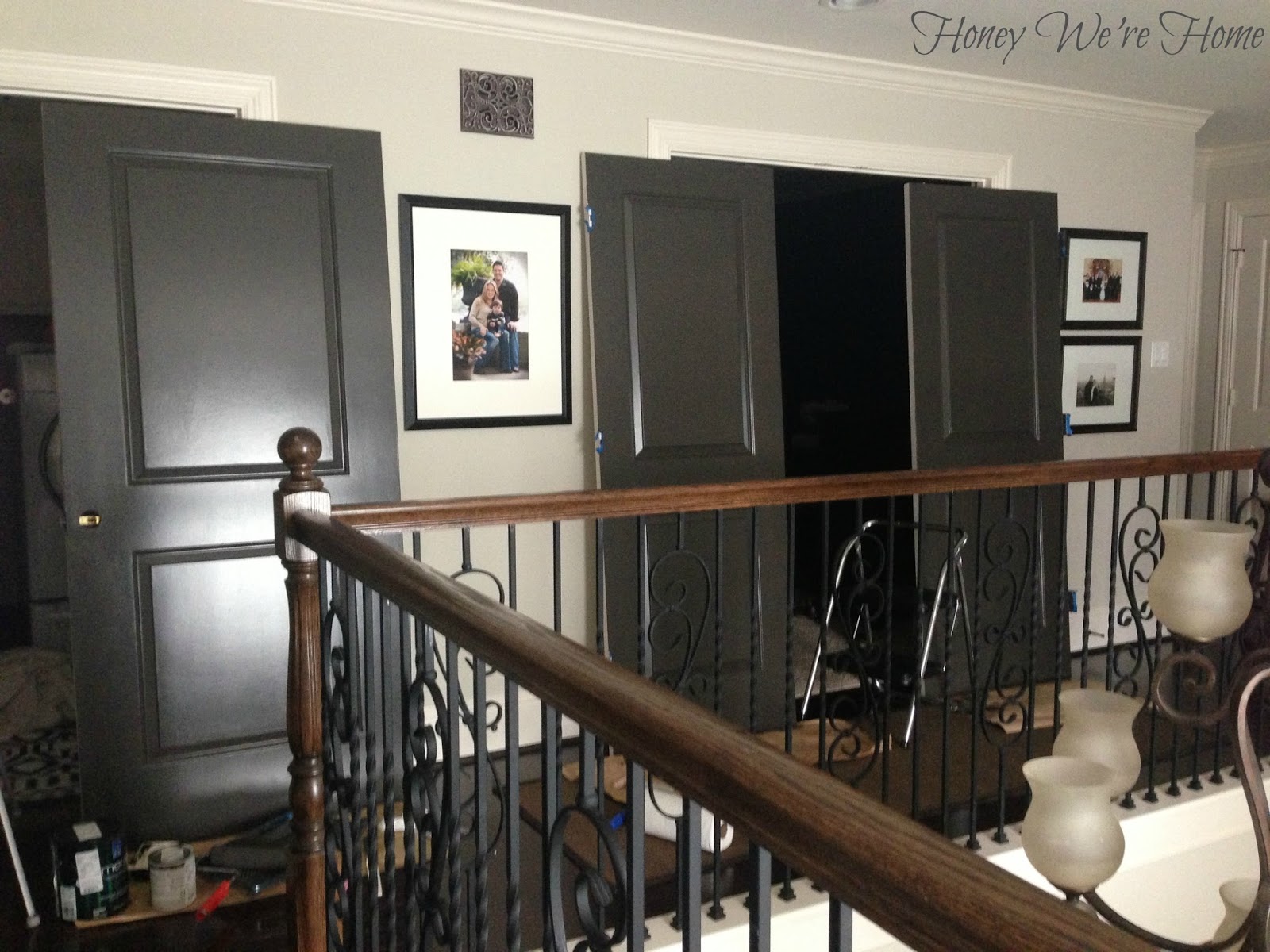
I only painted the front of the doors, but ended up going back and painting the inside edge of the media room doors because you could still see the white when the doors were shut.  The picture above shows the doors before I painted that inner edge.  


For comparison, here are some before and after shots:


***


***


 ***


I'm really liking the contrast, but now I need to do the hall linen closet double doors on the wall opposite that mirror! 


What do you think of the change?  Is this something you would do in your home?  If so, what color would you use?


Sunday, August 11, 2013

Blog Friends

My friend Cassie (Hi Sugarplum) is the first "blog friend" I made, and when I was on my way to meet her in person for the first time, it felt like I was driving to an internet blind date.  But, we hit it off right away -- it's impossible not to immediately like her -- she is genuine and smart and too cute for words.  Even though she is really funny and witty, she is also someone you can be completely honest and real with.  I've come to truly appreciate our friendship and her point of view/support when I need it.  Nearly three years later, we've managed to get together a few more times, although we live in different cities. Cassie stopped by this weekend on her way to Galveston, which is where James and I will be hanging out with her and her sweet kiddos today!


Also, I get to play Cassie's 20 Questions on her blog today, where you can find out some random things about me like my height, high school jam, and totally inane talent (hint: it involves my feet:)


P.S. Did I mention Cassie's kitchen is in BETTER HOMES AND GARDENS right now?!  It's the Kitchen and Bath special issue publication on sale through winter.  I couldn't help but tell the cashier, "My friend is in this magazine!"  She got all excited too and had me show her! :)


I hope you enjoy your Monday! I'll be back soon to show you how my dark grey hallway doors and striped foyer turned out.  I've been on a painting kick lately - if you follow me on Instagram (@honeywerehome), you can see some sneak peeks!


* * * * *


Wednesday, August 7, 2013

Art via Etsy and Lara Casey Shop

Etsy and online sources are a great find for affordable art and I finally had the chance to order a few pieces when thinking about a gallery wall for my office.  I bought a collection of typography, abstract art, watercolor, and illustrations.   I don't have that much wall space in my office though since the Ikea Expedit takes up a big chunk of the largest wall, I have a large window, and three doors.  So, only two of my prints are actually hanging on the wall!


This "Love Never Fails" print is from online retailer Lara Casey Shop in gold foil lettering (8x10) hung inside a matted Target frame.  It's just leaning against a mirror on my sideboard.


The frame holding the picture of James is also from Target and the orb is from Home Goods (spray painted gold).


Laura Casey also designs these gold foil prints:


My 6x6 abstract print is from Prima Creative Studio and she has some awesome work in her Etsy shop.  My little piece isn't framed, just sitting in an acrylic stand (that came with a desk calendar) in my bookshelf next to a jack I spray painted black. 


But I also like it propped up with a candle sitting on a few books.  


A few of my other faves from her shop are: 


I found "Be Still" on Etsy at Morgan Smith Designs for just $6 in an 8x10 print that I cut out and pinned to my inspiration board.  


The gold lips are from Gilded Mint and the woman is from Yulia Puchko.


Gilded Mint makes a pretty cute flamingo print and the coral is cool.


The illustrated tiger is from Ella Cute and sits in a Crate and Barrel mirrored frame in our living room bookshelf.


I'm also a fan of her Cheetah, Fox, and Bird drawings.


And for the kitchen I found this fun "Without Ice Cream there would be darkness and chaos" on Etsy via Old English Company.  This is so true for me! :)  Sadly, this frame had been hanging on the wall empty since December!! 


They also make these: 


What sources do you like for art?  Are there any Etsy shops I need to check out?


* * * * * 


Tuesday, August 6, 2013

Painted Media Cabinet & Bookshelf Styling

Painting the back of our media cabinet was one of the first projects I tackled when we moved into this house over three years ago.  I chose Jamestown Blue and painted the cabinets mostly while my then 4 month-old slept.  It's a pretty calming blue that worked well for a long time, but I was ready for a change- to dark gray.  I considered having the whole cabinet painted, but the quote was too high and I'm not confident enough in my painting skills to tackle such a big focal piece in our home by myself.  But, I can handle painting the back cabinet walls alone.  It only took one Sunday afternoon.


I used Sherwin Williams Urbane Bronze (matte), the same color I painted our back kitchen cabinets to create a cohesive look.  The two photos were taken at different times of day, and the white part of the cabinet (Sherwin Williams Divine White) is more like the top photo- it looks a little warm in the bottom picture.  The Urbane Brown is a dark gray, with a slight hint of brown in it.  


I did not prime or paint white over the blue, just applied two coats of the Urbane Bronze.  


The best part of painting is removing the painters tape and admiring your work! I'm not good enough for cutting in by hand, but maybe someday.  


As soon as the paint was dry, I got to work restyling the shelves.  I changed some objects and books around since they looked different against the dark gray.  I love how white pops against the dark background, so I added more white accessories.  A few books with dreary covers were recovered in a silver snakeskin or plain white wrapping paper.     


The faux boxwood came in a brown ceramic pot that I spray painted white.  I found the tiger print on Etsy.  I have a couple more prints I'd like to sprinkle in, but this is good for now. 


On the left side, a funky pair of candlesticks flanks a picture of James when he first started walking-sweet memories! Varying the height and color of the books with pops of lime green and pink keeps the bookshelves from looking too serious. 


That lime green book on the far left is covered in scrapbook paper too, to bring in more of that cheerful color.


On top, I spray painted a larger black frame white and covered one of the books with blue and white quatrefoil paper.  For almost all of the books on the shelves, the jackets were removed.


Most of you know that this media cabinet was built-in when the house was built, so it wasn't purchased from a store.  A few industrious people have asked about measurements and so forth, so I measured for you in case you are building something similar.  I hope this helps!  When we had a small townhouse, we used the Pottery Barn Logan as our media center and it was very well built.


Do you like the new dark gray color or prefer the old blue better? 


* * * * * 


Thursday, August 1, 2013

Office Updates // Inspiration Board and Rattan Chair

Ever since switching up the paint in my home office from light yellow to white (Divine White by Sherwin Williams), I've been making changes to the room and it's finally coming together.  I decided on a color palette of black, gold, pink, blush, and white -- which I am also considering for a blog redesign.


I put together an inspiration board filled with these colors and added it to a nook in my office, just to the right of my desk. You can see how I made the inspiration board HERE with the black and white polka dot fabric.


The inspiration board if full of colors, quotes, photos, and illustrations that are meaningful to me.  


Some of the prints are pins I pinned on Pinterest and printed at Walgreens.  


I like the white font on black background and can always be reminded to "be still."  I'm still looking for "Thy will be done."


The chair was a random find at Ikea.  I'd been looking online for something similar forever, but finally found this one day while browsing the store with my son.  When we took it to the car, he noticed me struggling and kept saying, "The chair won't fit in the car Mama."  Yes, I know.  We had to be rescued from the store:) Oops.  Has that happened to you?


The chair is called the Storsele and is made of rattan, but they aren't selling it online.  The shape and height is just right for this corner of the room.  It would also be nice to layer a throw blanket in the seat- need to see what I have around the house.


I'm using my silver HomeGoods table here too with some books and gold urchin.  


You can see how I covered that second book with fabric HERE.


I hope y'all have a great weekend!  I'll be announcing the winner of the $100 gift certificate to Festive Home Decor on Monday.  Go HERE to enter. :)


* * * * * 


UPDATE: I just made these images with Recite website.  It's so easy (and free!), you just type in your quote and scroll through a list of backgrounds to choose the one you want. 


Cool, huh?!


* * * * *